I have read many technical blogs that clarified my understanding of some topics in the past. Some notable shoutouts are this visual information theory breakdown, and this post on Maxwell's demon. They are both very thorough and I recommend you read them.
I think technical blogs are an essential source of knowledge, because in order for someone to write them, they need to understand deeply (and empirically) whatever they're trying to explain to you. Plus, they are also written in a way that you're supposed to understand, unlike papers. I encourage you to write one of your own!
This brief write-up is my first attempt to contribute back by illustrating some interesting geometrical properties of binomial events I found through a statistics class I'm taking this semester.
Picture a fair coin. There are two outcomes: heads or tails, each with a 50% chance, respectively.
If you wanted to know the chances that this coin lands on heads N times consecutively, and each flip is independent, you can just multiply:
Now, you probably already know these formulas if you took a probability class in college or high school.
What you might not have learned there is that geometry is a powerful way of describing probability, specifically when partitioning a set A with all the outcomes of interest.
3Blue1Brown's video on Bayes' theorem does a great job of visualizing how one can consider all the possible outcomes (in their example, the profession of a group of people) as a rectangle that can be broken down into overlapping sections from which Bayes' theorem can be derived. You can watch it here.
Applying this to the coin toss question, we can visualize all the possible heads and tails sequences ('HHHTTT', 'HTHTHT', 'HHHHHH', etc) one may get after tossing a coin six times with a similar visualization: a sample space. A sample space is a visualization of all the possible discrete outcomes or paths that may happen for a given experiment. In this example, coin toss sequences.
![Coin Sample Space Sample Space for 6 Consecutive [Independent] Coin Tosses](/blog/assets/coin-sample-space-n-6.png)
Show visualization code
import matplotlib.pyplot as plt
import numpy as np

num_flips = 6  # Visualize 6 flips

fig, ax = plt.subplots(figsize=(14, 8), facecolor='black')
ax.set_facecolor('black')

colors = plt.cm.Blues(np.linspace(0.3, 0.9, num_flips + 1))

def outcome_to_sequence(outcome, length):
    if (length == 0):
        return ''
    bits = format(outcome, f'0{length}b')
    return ''.join('H' if bit == '1' else 'T' for bit in bits)

for flip in range(num_flips + 1):
    total_outcomes = 2**flip
    height = 1 / total_outcomes

    # Draw all possible outcomes at this level
    for outcome in range(total_outcomes):
        y_position = outcome * height

        rect = plt.Rectangle((flip, y_position), 0.8, height,
                            linewidth=1, edgecolor='black',
                            facecolor=colors[flip], alpha=0.7)
        ax.add_patch(rect)

        if flip <= 5:  # Label first few
            label = outcome_to_sequence(outcome, flip)
            ax.text(flip + 0.4, y_position + height/2, label,
                   ha='center', va='center', fontsize=8)

ax.set_xlim(-0.5, num_flips + 0.5)
ax.set_ylim(0, 1)
ax.set_xlabel('Coin Flip Number', fontsize=12, color='white')
ax.set_ylabel('Probability space (0–1)', fontsize=12, color='white')
ax.set_title(f'Sample Space Division: {num_flips} Coin Flips\n(Total outcomes = 2^{num_flips} = {2**num_flips})', fontsize=14, color='white')
ax.set_xticks(range(num_flips + 1))
ax.grid(axis='x', alpha=0.3, color='white')

ax.tick_params(colors='white')
for spine in ax.spines.values():
    spine.set_color('white')

plt.tight_layout()
plt.savefig('sample_space_tree.png', dpi=150)
plt.show()
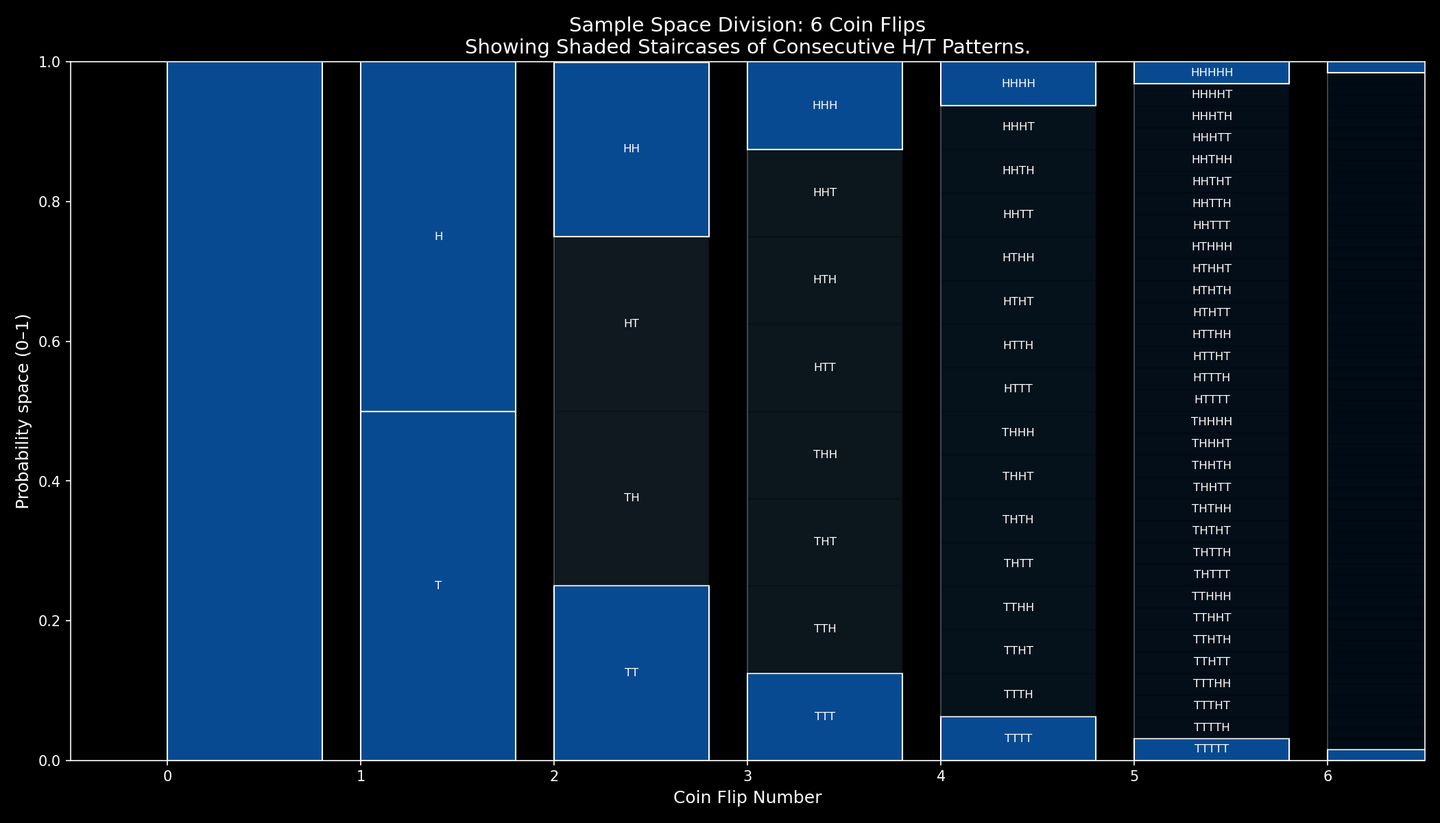
The first block on the left shows the 0th coin flip. Since it has a guaranteed probability of happening, it occupies the whole Y-axis. The second block shows the outcome of the first coin toss. Since it can be either a head or a tail, it occupies two evenly spaced blocks.
Further to the right, each block doubles in its number of outcomes, which makes sense intuitively because we're expanding each coin toss with 2 children outcomes respectively.
The Y-axis gives the probability for each single path to happen according to its proportion. Paths along the center — with an even variation between heads and tails — occupy a bigger part of the Y-axis, as naturally, they're the most probable, while paths of consecutive heads or tails (either going fully down or up, in a staircase pattern), occupy an ever-decreasing proportion of the Y-axis, relative to their very low probabilities as shown below.

Show visualization code
import matplotlib.pyplot as plt
import numpy as np

num_flips = 6

fig, ax = plt.subplots(figsize=(14, 8), facecolor='black')
ax.set_facecolor('black')

colors = plt.cm.Blues(np.linspace(0.3, 0.9, num_flips + 1))

def outcome_to_sequence(outcome, length):
    if length == 0:
        return ''
    bits = format(outcome, f'0{length}b')
    return ''.join('H' if bit == '1' else 'T' for bit in bits)

for flip in range(num_flips + 1):
    total_outcomes = 2**flip
    height = 1 / total_outcomes

    for outcome in range(total_outcomes):
        y_position = outcome * height

        # Highlight staircase: all T (outcome=0) or all H (outcome=max)
        is_staircase = (outcome == 0 or outcome == total_outcomes - 1)

        if is_staircase:
            facecolor = colors[-1]  # Darkest blue from the original scale
            alpha = 1.0
            edgecolor = 'white'
        else:
            facecolor = colors[flip]
            alpha = 0.15
            edgecolor = 'black'

        rect = plt.Rectangle((flip, y_position), 0.8, height,
                            linewidth=1, edgecolor=edgecolor,
                            facecolor=facecolor, alpha=alpha)
        ax.add_patch(rect)

        if flip <= 5:
            label = outcome_to_sequence(outcome, flip)
            ax.text(flip + 0.4, y_position + height/2, label,
                   ha='center', va='center', fontsize=8, color='white')

ax.set_xlim(-0.5, num_flips + 0.5)
ax.set_ylim(0, 1)
ax.set_xlabel('Coin Flip Number', fontsize=12, color='white')
ax.set_ylabel('Probability space (0–1)', fontsize=12, color='white')
ax.set_title(f'Sample Space Division: {num_flips} Coin Flips\nShowing Shaded Staircases of Consecutive H/T Patterns.', fontsize=14, color='white')
ax.set_xticks(range(num_flips + 1))
ax.grid(axis='x', alpha=0.3, color='white')

ax.tick_params(colors='white')
for spine in ax.spines.values():
    spine.set_color('white')

plt.tight_layout()
plt.savefig('coin-sample-space-shaded-staircase.png', dpi=150)
plt.show()
Are you starting to see the link between geometry and probability here? You could measure the probability for any given sequence by picking its terminal block and measuring its height. It makes questions like how likely are you to get a specific sequence like 'HTHHTHH' easy to answer; just trace the graph!
So why is this important? As you may recall from the law of large numbers, over enough runs, outcomes average out to their true probabilities. If you flip a fair coin forever and count how many times you get heads or tails, the chance of getting either becomes 50% and 50%. The above graph doesn't really make this intuitive, though. After all, it seems like the most likely sequences simply collapse into blobs of increasing length.
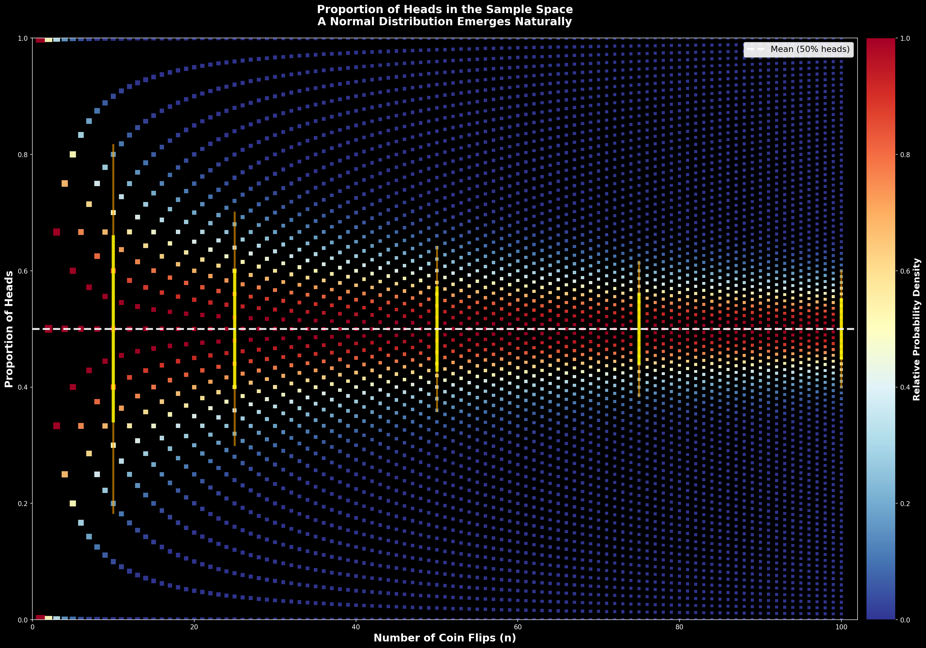
But something is hiding in plain sight: a normal distribution. If we plot the proportion of times we get heads in the sample space as shown below, there is a clear bell shape before the true 50% proportion converges.

Show visualization code
import matplotlib.pyplot as plt
import numpy as np
from scipy.special import comb

num_flips = 100

fig, ax = plt.subplots(figsize=(20, 14), facecolor='black')
ax.set_facecolor('black')

for flip in range(1, num_flips + 1):
    max_prob = comb(flip, flip // 2, exact=True) * (0.5 ** flip)
    marker_size = max(5, 200 / np.sqrt(flip))

    for num_heads in range(flip + 1):
        prob = comb(flip, num_heads, exact=True) * (0.5 ** flip)
        relative_prob = prob / max_prob
        color = plt.cm.RdYlBu_r(relative_prob)
        y_proportion = num_heads / flip

        ax.scatter(
            flip,
            y_proportion,
            c=[color],
            s=marker_size,
            marker='s',
            edgecolors='none',
            alpha=0.95,
            rasterized=True
        )

ax.axhline(
    y=0.5,
    color='white',
    linestyle='--',
    linewidth=3,
    alpha=0.9,
    label='Mean (50% heads)',
    zorder=10
)

flip_points = [10, 25, 50, 75, 100]
for flip in flip_points:
    std_dev = np.sqrt(flip * 0.5 * 0.5)
    std_proportion = std_dev / flip

    ax.plot(
        [flip, flip],
        [0.5 - std_proportion, 0.5 + std_proportion],
        'yellow',
        linewidth=5,
        alpha=0.8,
        zorder=9
    )

    ax.plot(
        [flip, flip],
        [0.5 - 2 * std_proportion, 0.5 + 2 * std_proportion],
        'orange',
        linewidth=3,
        alpha=0.6,
        zorder=8
    )

ax.set_xlim(0, num_flips + 2)
ax.set_ylim(0, 1)
ax.set_xlabel('Number of Coin Flips (n)', fontsize=16, fontweight='bold', color='white')
ax.set_ylabel('Proportion of Heads', fontsize=16, fontweight='bold', color='white')
ax.set_title(
    'Proportion of Heads in the Sample Space\n'
    'A Normal Distribution Emerges Naturally',
    fontsize=17,
    fontweight='bold',
    pad=20,
    color='white'
)

sm = plt.cm.ScalarMappable(cmap=plt.cm.RdYlBu_r, norm=plt.Normalize(vmin=0, vmax=1))
sm.set_array([])
cbar = plt.colorbar(sm, ax=ax, pad=0.01, fraction=0.046)
cbar.set_label('Relative Probability Density', fontsize=14, fontweight='bold', color='white')
cbar.ax.yaxis.set_tick_params(color='white')
plt.setp(plt.getp(cbar.ax.axes, 'yticklabels'), color='white')

ax.legend(loc='upper right', fontsize=13, framealpha=0.9)

ax.tick_params(colors='white')
for spine in ax.spines.values():
    spine.set_color('white')

plt.tight_layout()
plt.savefig('coin-sample-space-proportion-heads.png', dpi=150, bbox_inches='tight', facecolor='black')
plt.show()
Now, we can see that the proportion will indeed even out to 50%, and if we expanded this to many more N we'd end up seeing a completely straight line.
What's interesting is that at N < 20 the distribution of outcomes is mostly normal. The yellow lines act as a visual aid: if we stopped sampling proportions at those lines, the center would follow the central limit theorem, accumulating most outcomes and smoothing out to a bell, while the very edges show two types of outcomes: at first, either getting a head or not, and at a very low probability, consecutively not getting any head or consecutively getting all heads.
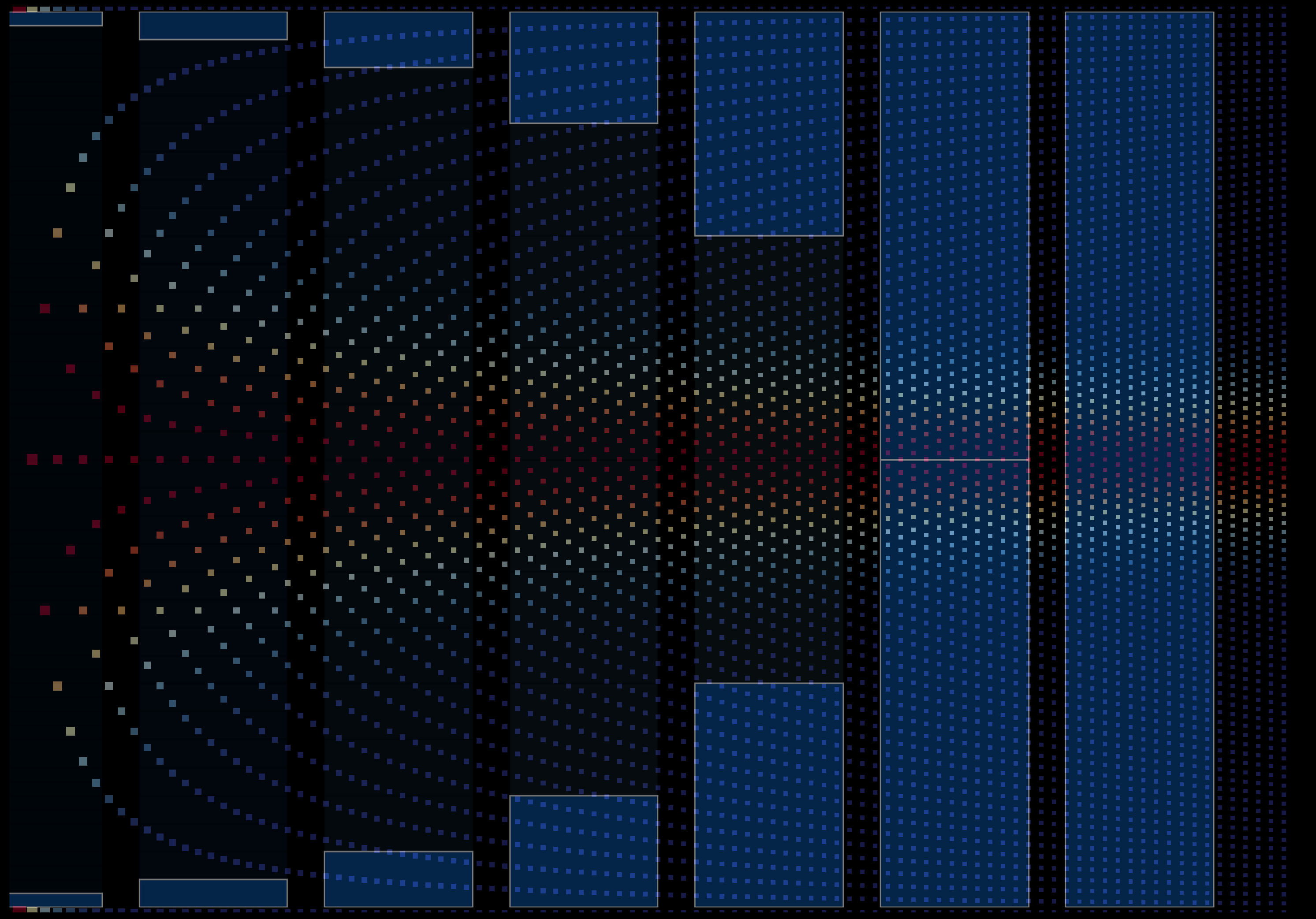
We can explain this intuitively by looking at the previous figure overlaid and mirrored on the sample space distribution plot:

Show visualization code
from pathlib import Path

import matplotlib.pyplot as plt
import numpy as np
from PIL import Image
from scipy.special import comb

NUM_FLIPS = 100
STAIRCASE_FLIPS = 6
BASE_FILENAME = 'coin-sample-space-proportion-heads-clean.png'
STAIRCASE_FILENAME = 'coin-sample-space-shaded-staircase-clean.png'
OUTPUT_FILENAME = 'coin-sample-space-overlay.png'
ALPHA_SCALE = 0.5


def generate_distribution_base(output_path):
    fig, ax = plt.subplots(figsize=(20, 14), facecolor='black')
    ax.set_facecolor('black')

    for flip in range(1, NUM_FLIPS + 1):
        max_prob = comb(flip, flip // 2, exact=True) * (0.5 ** flip)
        marker_size = max(5, 200 / np.sqrt(flip))

        for num_heads in range(flip + 1):
            prob = comb(flip, num_heads, exact=True) * (0.5 ** flip)
            relative_prob = prob / max_prob
            color = plt.cm.RdYlBu_r(relative_prob)
            y_proportion = num_heads / flip

            ax.scatter(
                flip,
                y_proportion,
                c=[color],
                s=marker_size,
                marker='s',
                edgecolors='none',
                alpha=0.95,
                rasterized=True
            )

    ax.set_xlim(0, NUM_FLIPS + 2)
    ax.set_ylim(0, 1)
    ax.set_xticks([])
    ax.set_yticks([])

    for spine in ax.spines.values():
        spine.set_visible(False)

    plt.tight_layout()
    plt.savefig(output_path, dpi=150, bbox_inches='tight', facecolor='black')
    plt.close(fig)


def generate_staircase_overlay(output_path):
    fig, ax = plt.subplots(figsize=(14, 8), facecolor='black')
    ax.set_facecolor('black')

    colors = plt.cm.Blues(np.linspace(0.3, 0.9, STAIRCASE_FLIPS + 1))

    for flip in range(STAIRCASE_FLIPS + 1):
        total_outcomes = 2**flip
        height = 1 / total_outcomes

        for outcome in range(total_outcomes):
            y_position = outcome * height
            is_staircase = (outcome == 0 or outcome == total_outcomes - 1)

            if is_staircase:
                facecolor = colors[-1]
                alpha = 1.0
                edgecolor = 'white'
            else:
                facecolor = colors[flip]
                alpha = 0.15
                edgecolor = 'black'

            rect = plt.Rectangle(
                (flip, y_position),
                0.8,
                height,
                linewidth=1,
                edgecolor=edgecolor,
                facecolor=facecolor,
                alpha=alpha
            )
            ax.add_patch(rect)

    ax.set_xlim(-0.5, STAIRCASE_FLIPS + 0.5)
    ax.set_ylim(0, 1)
    ax.set_xticks([])
    ax.set_yticks([])

    for spine in ax.spines.values():
        spine.set_visible(False)

    plt.tight_layout()
    plt.savefig(output_path, dpi=150, bbox_inches='tight', facecolor='black')
    plt.close(fig)


def overlay_images(base_path, overlay_path, output_path):
    if not base_path.exists():
        print(f'Missing base image: {base_path}')
        return
    if not overlay_path.exists():
        print(f'Missing overlay image: {overlay_path}')
        return

    base = Image.open(base_path).convert('RGBA')
    overlay = Image.open(overlay_path).convert('RGBA')

    overlay_flipped = overlay.transpose(Image.FLIP_LEFT_RIGHT)
    overlay_resized = overlay_flipped.resize(base.size, Image.LANCZOS)

    r, g, b, a = overlay_resized.split()
    a = a.point(lambda v: int(v * ALPHA_SCALE))
    overlay_transparent = Image.merge('RGBA', (r, g, b, a))

    combined = Image.alpha_composite(base, overlay_transparent)
    combined.save(output_path)


def main():
    assets_dir = Path(__file__).resolve().parent.parent
    base_path = assets_dir / BASE_FILENAME
    staircase_path = assets_dir / STAIRCASE_FILENAME
    output_path = assets_dir / OUTPUT_FILENAME

    generate_distribution_base(base_path)
    generate_staircase_overlay(staircase_path)
    overlay_images(base_path, staircase_path, output_path)


main()
The extreme edges of the bell line up with consecutive coin paths, which are very unlikely, while the majority of outcomes that occupy the biggest proportion along the center of the sample space (where heads appears 50% of the time) correspondingly line up with the center of the bell, showing that the Central Limit Theorem emerges geometrically from the branching structure of a binomial sample space.
Another way to think about this is that if you re-scale the sample space to show the least likely sequences to be smaller and the most likely to be bigger, the proportion of times that heads appears is distributed close to normally [discounting for the gap between consecutive sequences and roughly normal sequences] until the law of large numbers kicks in and averages out to 50%. Zooming out from the coin-toss example, this is applicable to any binomial process of independent events.
Is this news? Perhaps not. But it is very cool to see how probability can be translated into areas and proportions, which can in turn reveal the underlying probability distribution for a specific outcome in a visual, geometric manner.
I used Perplexity with Claude 4.5 Sonnet to work through my ideas. Originally, I began making the above graphs and experiments during class when I got carried away trying to solve a problem by drawing boxes, which led to me seeing the staircase pattern (in the context of rigged coins), and digging deeper into the math. It walked me through how this nicely ties up with Pascal's triangle:
What we've visualized here is actually a rotated form of Pascal's triangle—a well-established mathematical structure where each number is the sum of the two numbers above it. The connection runs deep: at each flip number N, counting how many paths lead to exactly k heads gives you the entries in row N of Pascal's triangle. These are the binomial coefficients C(N,k), which represent the number of ways to choose k items from N. When we divide each row by 2^N to convert counts into probabilities, we get the binomial distribution. The Central Limit Theorem then guarantees that as N grows large, this distribution approaches the normal curve—which is exactly what we see in our visualization. The geometry of branching paths through sample space doesn't just resemble Pascal's triangle; it is Pascal's triangle, revealing why the bell curve emerges so naturally from repeated binary trials.
In hindsight, it's a very intuitive conclusion, as the count of events in each column of the coin sample space matches the sum of the Nth row in Pascal's triangle.
If you found this useful or interesting, I'm glad! Do consider writing a technical blog of your own. In an AI-dominated era, mindful writing is more valuable than ever. It is also very useful to enrich your own understanding of things.
1. I promise I did not go out of my way to write this blog post just to show the visualization of the proportion of heads. It is extremely cool, and reminds me a bit of slope fields.
2. If you're curious about the aforementioned chat I had with Claude with my thinking process, you can read it here.